Arsenal, Liverpool, Man Utd score highly, Newcastle slammed in 25/26 Premier League away and third kit rankings

When you’ve ranked all the new Premier League home kits, you have quite literally no choice but to do the same for the away and thirds as well. It’s basically a contractual obligation at that point.
There are still plenty of gaps to fill in here – especially with the third kits – but we’ve used information from leaks where they’re clear enough and we trust them to actually be correct. Although we do reserve the right to update any ranking after we actually see the kits. We probably won’t though, because we forget.
As ever, before complaining that we’re wrong about your team’s kit, do take a moment to consider that actually in fact our opinion is the most important and above all correct one. It’s just easier for all of us if you just accept that.
25. Newcastle away
If you’ve read any of these before you’ll know we quite often do a bit of sick in our mouths at the cynical way these huge multinational sportswear companies try to fill their shirts with tributes and influences from the local area the designer has almost certainly never visited or cared about before.
Away days write their own history. ✨
The Newcastle 25/26 away jersey, available August 1.@adidasfootball pic.twitter.com/1RIARd1hBN
— Newcastle United (@NUFC) July 29, 2025
We do grudgingly accept they can and do sometimes work nicely. What we will never accept, though, is the sheer brass balls of trying to claim the ‘local tribute’ angle to a Newcastle away kit that is literally the exact same colour as the Saudi Arabia kit.
That’s not us making mischief, either. Saudi Arabia’s current adidas kit is ‘Team Green’ and so too is this Newcastle kit. They’ve had a Saudi-inspired kit every year since the takeover, and that’s fine. Well, not fine, but you know what we mean.
If you want to pay tribute to the lovely lads who own your club every single season, then that’s up to you. It’s for you and your conscience to argue that particular point.
But don’t then try to kid any of us when your latest kit with its very, very obvious primary source of inspiration also has some curved lines on it so you can say “Like, Tyne Bridge or something, yeah”. F*ck off with that insult to our collective intelligence.
24. Brighton away
There’s nothing really wrong with a boring away kit, but there is something wrong when you get a boring away kit that is clearly desperately trying to be interesting. Look! It’s got two shades of purple on it! Just a massive shrug of the shoulders from us here, unfortunately.
Central badges aren’t our bag, either, and we cannot work out for the life of us why Brighton’s badge is rendered in black and white here; it’s a colour choice that appears to have nothing to do with either the club’s usual palette or this shirt’s.
Standard stripes rather than the large central dark panel flanked by the washed-out lilac-ish might have worked better.
Carlos in our new away kit. 😮💨 pic.twitter.com/lITmIABFrS
— Brighton & Hove Albion (@OfficialBHAFC) July 31, 2025
23. Aston Villa away
Maybe it’s just that we’re so sick of the ‘local inspiration’ angle to kits these days, but we don’t care for this one and its tribute to the Selfridges bit of the Bullring. You know the one – the unusual shaped bit with all silver panels on it.
You can sort of see the nod to the architecture on the sleeves here, but while there’s nothing wrong with what is an undeniably smart and sleek monochrome effort – especially with that aesthetic carrying through all the logos and sponsors and whatnot – there are just several better black kits than this one around this season.
How may we assist you? 🅰️🅰️ pic.twitter.com/Ga2NmuCpEC
— Aston Villa (@AVFCOfficial) July 31, 2025
22. Arsenal third
One of the most important elements to our thinking for the home shirt rankings is the vague yet ‘know it when we see it’ sense of ‘does it look and feel like a Team X shirt?’ It is hugely unscientific, but it forms a large part of our process there.
Can we always say with certainty why, say, a Spurs shirt actually looks like a Bolton shirt or a Burnley shirt looks like a West Ham shirt or a Sunderland shirt look like a Southampton shirt? No. But when it happens, we mark down harshly.
Generally speaking, we have no such qualms around away and third shirts where there is by definition far more freedom in the colours and proportions and so forth.
This, though, gives off such a powerful ‘Man United away kit’ vibe that we just can’t get past it, and unfortunately an objectively nice kit is scored very harshly despite getting two hefty dollops of bonus points for the adidas trefoil and Arsenal cannon.
What’s really weird, though, is that Arsenal had the exact same colours for their third kit last season and that didn’t scream Man United at all. It is more art than science, this. And more whim than art.
🚨 Leaked official images of Arsenal’s third kit for the 2025/26 season, set for launch next month. ✅👕
📸 @IamCrisJ pic.twitter.com/vHk6f0fUFf
— afcstuff (@afcstuff) July 15, 2025
21. Chelsea away
It’s a tribute to a 50-year-old away kit which was itself a tribute to the Magnificent Magyars Hungary team of the ’50s, but it’s also just really bloody dull, with the red and green elements foolishly scaled right back from striking bold adornments to pencil-thin stripes.
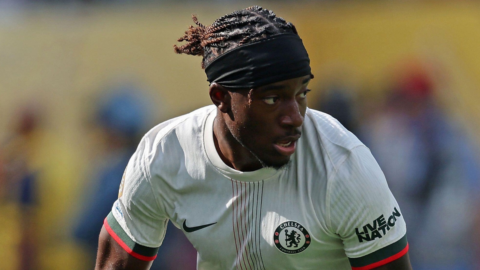
And while the colours on shirts being given really stupid names is neither new nor really the club’s fault, this one has some particularly egregious nonsense and we’re penalising it further for that because we can.
It may, you see, look like a white shirt with red and green bits on it to the untrained eyes of you or I, but these colours are in fact ‘Phantom’ and ‘Galactic Jade’ and, well, ‘Red’. And we make no apologies for the last one annoying us the most. It’s just lazy. Either commit to the bit or don’t bother.
20. Everton away
This feels like one we’re going to need to see in the flesh before being able to fully judge, because it’s all going to depend on what colour ‘wax yellow’ actually turns out to be.
From the pictures we’ve seen of it, that appears to be a sort of cricket-whites cream and our fear is the overall vibe with the navy shorts and ‘vanilla’ (colour, not style) socks is just going to be a little bit too Spurs.
Away kit debut tonight in Chicago! 💛 pic.twitter.com/weLFt6MK1M
— Everton (@Everton) July 30, 2025
19. Crystal Palace away
That’s surely a Wolves shirt, but look, we don’t mind the flex at all. If you can’t release a bold and garish gold kit after winning your first ever piece of major silverware, then when can you?
Although even writing that sentence has made us realise it should have been a silver kit, shouldn’t it? The FA Cup is not goldware. There’s more than one reason why tinfoil and not gold leaf is the preferred method for covering your cardboard FA Cup when your local non-league team reaches the first round for the first time.
The ‘Korean-style’ collar also looks a bit odd. We’re going to have our cake and eat it here; despite our frequent complaints about the modern trend for plain boring crew-neck collars on football shirts, there are still times when they are a solid and appropriate choice, and one of those is when you’ve already made the rest of the kit ostentatiously showy gold. This just isn’t a kit that needed a feature collar.
A good workout 💪
Thank you, @Mainz05en ❤️💙#CPFC pic.twitter.com/IvByVjRTeQ
— Crystal Palace F.C. (@CPFC) July 29, 2025
18. Brighton third
It’s last season’s yellow-with-navy-pinstripe away shirt.
We don’t mind this trend of giving away shirts a second season of life as a third shirt, and this is a perfectly adequate away/third shirt, but it’s never going to win top prizes here.

17. Liverpool away
Perfectly nice-looking kit, but we’ve got the same issue with adidas here as we did for Arsenal’s third kit: it just says ‘Man United away kit’ to us far more than it does ‘Liverpool away kit’. And if anything even more so here where the use of black seems to lean even harder into traditional United areas.
We do rather like that shield for the badge, though. And again, the shirt is absolutely rock solid. We just can’t quite work out why adidas have decided to mix two of what is now their Premier League ‘Big Three’ kits that appear better suited to the other. Especially as none of the three are particularly fond of each other.
… and so is our 2025/26 @adidasfootball away kit 😉
— Liverpool FC (@LFC) August 1, 2025
16. Manchester City away
Black is the new black for away kits this year, it seems, with Puma and City going heavily down the ‘metallic accent’ route here and, in our view, just ever so slightly overegging that particular pudding.
We like the black. We like the collar. We can happily live with the silver Puma cat and Etihad logos. But that full silver City badge is just too much. Rendering the badge in the colours of an away kit is almost always a good choice and we can see why it was felt necessary here, but it just doesn’t quite work. And on what is otherwise such a simple kit there’s really nowhere else to look which just makes it stand out more.
Suited up 😤 pic.twitter.com/kzyZvDaOPm
— Manchester City (@ManCity) July 18, 2025
15. West Ham away
The Hammers have really leant into a clean and simple aesthetic this season, and we’ve plenty of time for that. But when you have all three kits tied to that overall theme, it’s kind of inevitable that one is going to feel a little bit meh.
The home kit is the home kit, that’s rarely going to be the one. And definitely isn’t for West Ham this season, because that home kit is very strong. The navy and gold third kit also has plenty to grab the attention.
It is therefore this absolutely adequate away kit that ends up the spare wheel. There is quite literally nothing wrong with this at all, but the other West Ham kits simply have more that is right.
🥹 https://t.co/Pmqe2V1ZXl pic.twitter.com/cqWzrAFEQq
— West Ham United (@WestHam) July 18, 2025
14. Wolves away
Yes, that’s absolutely fine. It’s smart, it’s inoffensive, it’s got some classic football shirt elements with the collar and cuffs. It seems to be quite a nice colour. It’s apparently got a design on it that invokes the architecture of Molineux or some other such guffwaffle, whatever.
It’s fine, is the point. It’s an absolutely fine football kit. But it just doesn’t grab us by the bollards.
New shirt x new signing 🤩 pic.twitter.com/MPo0TFhqQF
— Wolves (@Wolves) July 25, 2025
13. Sunderland away
Things we almost always like in football shirts: being made by hummel, being a usable alternative for a chessboard.
We like this shirt, even if the (entirely correct and understandable) decision to use the club’s main colours on the collar just ever so slightly gives the whole thing a whiff of a pre-success Chelsea. It has the look of a kit you can imagine being worn when Stamford Bridge still had a car park behind the goal.
Boys in blue 💙📸 pic.twitter.com/oaVFLs6dtd
— Sunderland AFC (@SunderlandAFC) July 21, 2025
12. Newcastle third
We really are absolute suckers for adidas third kits and that trefoil. Very obvious nods to the 97/98 kit in the colour palette here if not perhaps the overall design, and everything here works wonderfully well.
The shields adidas have used for the badges on the third kits this year are a nice touch, and also in this particular case mean that using the full Newcastle badge in standard colours on a black background works far better than had they plonked it straight onto the blue shirt.
We’d normally be looking here for a more streamlined and simple version of the badge in the colourway of the shirt but this is much the best way available to keep the black-and-white stripes.
We hate the Newcastle home kit. The away kit has insulted our intelligence. This one nearly manages to right all those wrongs. No mean feat.
Elangs. 👊 pic.twitter.com/fZ5UqFnzck
— Newcastle United (@NUFC) July 11, 2025
11. Burnley away
This one comes with a ‘dynamic tonal graphic, designed using real soundwave patterns’ captured from recording crowd noise at Turf Moor, which is precisely the sort of sentence designed to make our teeth itch, but we’re willing to overlook it on this occasion because the result is very lovely indeed.
While we do consider ourselves members of the ‘away kit colours are a free-for-all’ tribe in that particular war, that doesn’t mean we aren’t as partial as the next kit obsessive to the beguiling simplicity of simply inverting the colours of the home kit.
Especially when, as here, it’s done on a kit that colours apart is strikingly different to its more oft-seen sibling.
We will also never ever not be pleased to see a crossover v-neck collar with some striping detail about it.
Bring the noise 🔊
Presenting Burnley’s 2025/26 Away kit – available online now 🎽
— Burnley FC (@BurnleyOfficial) July 31, 2025
10. Tottenham away
Our clear favourite among the large crop of black away kits this season. She’s an absolute beaut and one that also looks even better when seen in full on the pitch. We don’t hate metallic or neon detailing on a black shirt, but there’s something to be said for leaning into the monochrome simplicity, and Nike have done that beautifully here.
The square ‘SPURS’ pattern in the fabric gives just the right amount of detail to hit the sweet spot where you get a nice, clean, unfussy top but avoid the ‘just a black T-shirt’ pitfall.
Honestly, this would have been right in contention for top spot had it not been for the unforgivable levels of absolute bumwater in the PR guff that accompanied its launch.
Is it fair to penalise a blameless shirt for the warm cack some marketing dimwit came up with to accompany it? No. Will that give us even a single second’s pause before we drop it several places down the rankings? Also no.
That’s one way to introduce yourself. pic.twitter.com/JvQU32PimH
— Tottenham Hotspur (@SpursOfficial) July 19, 2025
9. Brentford away
Brown is a tough colour to pull off for a football shirt. Done wrong, you do risk ending up with something that looks quite literally like sh*t. But Joma and Brentford have done it right here, ending up looking far more like a lovely great big bar of Galaxy than a turd with all corn in it and stink lines coming off it. Well done.
Nice collar on this one too, and the gold doesn’t appear to be too ostentatious, which is another risk averted. Love, love, love the big bee logo.
Our 2025/26 away kit has arrived 🐝 pic.twitter.com/FTyhlP5okG
— Brentford FC (@BrentfordFC) July 25, 2025
8. Bournemouth away
A lovely thing. We want to say it’s blue and black stripes, but the stripes are so wide it’s almost a central black panel we’re looking at here. We don’t mind it at all. The light blue pinstripes pop beautifully between the stripes/panels/whatever, and the elegance with which the umbro mark and Bournemouth badge sit within the two blue stripes is just very lovely indeed.
And while we’re on the subject: just look at that badge. We are suckers for a club crest re-rendered in the appropriate colourway for an away kit and this is just an absolutely fabulous example of it. More excellent use here of that lighter blue that really pulls the whole kit together.
Very few notes on this one.
Soon 👊 pic.twitter.com/NSavoFBzvT
— AFC Bournemouth 🍒 (@afcbournemouth) July 30, 2025
7. Tottenham third
They were so close. So, so close. Almost everything about this is just so, so good. The vibrant yellow and navy is a classic Tottenham change kit colourway, the Total 90 template remains sensational even if we do find the very idea that anything from a year beginning with a ‘2’ might now be considered fair game for raking in the retro-nostalgia coin slightly uncomfortable.
We already wake up every morning with at least three new aches and pains; we really didn’t need any further reminders of our own march to decrepitude and the freewheeling passing of time.
Where were we? Yeah. Cracking kit. Lovely old Spurs badge from the before times when we could put socks on standing up. But look where they’ve put that badge. It’s in the middle, isn’t it? Where it shouldn’t be, and with the Nike swoosh all the way out on the breast.
We’ve said it before and we’ll say it again: if you must deploy a central club crest, you simply must also centralise the maker’s mark. It’s a basic question of balance. This example of this unacceptably frequent misstep upsets more than most, given the otherwise 10/10 shirt they’ve decided to slightly spoil for simply no good reason.
🚨⚪️: Tottenham 25-26 Third Kit Leaked!!! pic.twitter.com/EaLFIXouGp
— Tottenham Transfer News (@thfc_T_news) July 10, 2025
6. Manchester United away
Fair play, giving both Arsenal and Liverpool away/third kits this season that look very Man United away kit and then giving Man United an away kit that is better than both anyway is quite a good bit.
We like this one a lot, especially for the clever use of the ‘snowflake’ imprint. It’s a motif whose association with United goes all the way back to that belting early ’90s away kit, and a design adidas have since leant on for United with even more enthusiasm than they have Arsenal and the lightning bolt. They even did it last season and have gone back to the well again.
But if it works, it works. And what they’ve done for United here that maybe isn’t quite so true of the (nevertheless strikingly excellent) Arsenal away kit is do something new and different with it. In this case that means making it all massive.
Further ticks for this high-ranking effort arrive for the overlapping collar and use of the devil logo in place of the full badge.
The skipper gets our first goal of pre-season 😍 pic.twitter.com/sXSdwOGB0j
— Manchester United (@ManUtd) July 26, 2025
5. West Ham third
A case study in how to use metallic tones on your kit without stumbling down Gaudy Ghastliness Boulevard.
The navy jacquard is a perfect base for the understated gold, and stripping the West Ham badge right back to the two Hammers again helps keep things unfussy and classy.
A suitably retro collar to finish off a very retro-feel kit completes a very strong overall package. West Ham have very good kits this season.
All style on set 📸 pic.twitter.com/iksInxylPr
— West Ham United (@WestHam) July 30, 2025
4. Leeds away
Somehow only the second best Adidas tribute to an iconic Nike kit in the Premier League this season, but that’s not really a criticism. Other things that are not really criticisms: not quite as good as this season’s home kit, not quite as good as last season’s away kit.
It’s not far off a direct facsimile of the 2001-03 Leeds kit, but none the worse for that. The yellow details are all spot on, and the yellow-white-yellow for the adidas stripes is absolutely the correct choice as well.
🔗 LR x WG pic.twitter.com/8jwCiCNrxX
— Leeds United (@LUFC) July 22, 2025
3. Manchester United third
Very bold to do a tribute to a kit that can only bring to mind images of Eric Cantona kung-fu kicking a Crystal Palace fan. Very bold, and it turns out very correct. Because this is excellent. Lovely shield on there, as in the 93-95 umbro kit to which this doesn’t so much subtly nod as hold up great big neon arrows with flashing signs on them saying “Remember when Eric sorted out that wrong’un lol”.
The simple yet full Man United club badge works nicely on that shield and we will continue to award bonus points for all adidas third shirts that feature the trefoil. Brilliant collar on this one too, with just the right amount of the blue and yellow.
The self-stripe is subtly done, with little Red Devil logos hidden in there rather nicely. We’re very greedy and would very much have liked those to instead have been silhouettes of Cantona mid-kick, but we do also understand why such an obviously correct idea is in the real world outside our head a non-starter. Still. Shame, though.
🚨 Official photos of the new Manchester United 2025/26 third kit ⚫️🟡🔵
(via @Footy_Headlines) #MUFC pic.twitter.com/g4E43fIcBl
— United Zone (@ManUnitedZone_) July 29, 2025
2. Liverpool third
We could take or leave the new adidas home kit. The away kit appears to be a hastily repurposed Man United cast-off. But this? This is the very best of stuff.
We’d have loved this to be the official away kit, because it just seems very, very correct for Liverpool’s return to adidas to be marked by a green away kit given some of the iconic green Liverpool kits of the past.
But had this been the away rather than third kit, it wouldn’t have had the adidas trefoil logo, so we’re going to say on balance we’re happy it’s the third. Because who doesn’t love a trefoil?
Everything else here also screams classic, from the round crossover collar to the matching clubs and simple stripe pattern in the fabric to the full Liverpool badge.
There’s nothing particularly wrong with adidas’ home and away offerings on their first year back with Liverpool, but this is the one they’ve got absolutely right. This feels like it’ll be one of those kits that becomes a terrace staple for years to come.
I can’t lie, Adidas have smashed the Liverpool kits 🤩 pic.twitter.com/CcVvZFMShS
— EVO.io Football (@EVOFtbl) July 31, 2025
1. Arsenal away
There seems to be some strange and powerful magic that strikes any time adidas draw inspiration from a mid-90s Nike Arsenal kit. There’s something just nice and wholesome anyway in the way one of the two football kit giants is willing to acknowledge the work of the other and, while most would correctly agree that adidas are the correct company to make Arsenal kits – we will not and cannot elaborate, it’s just fact – Nike certainly made some cult classics.
First start, five-star 🤩
Your POTM, Martin Zubimendi! pic.twitter.com/N5ozlAXD7E
— Arsenal (@Arsenal) July 27, 2025
Among them was the 95/96 blue lightning bolt away kit that adidas are – not for the first time – leaning into here, taking the colour palette and lightning motif, throwing in more than a hint of their own classic late-80s designs and coming up with this absolute dazzler.
It is so, so much better than last year’s away kit when, instead of drawing inspiration from a beloved Arsenal kit from the past a rare yet gigantic mis-step from the Germans saw them instead influenced by a bottle of Lynx Africa.
The only minor grumble one could reasonably have here is the similarity to a third kit Arsenal had a few years ago, and thus the fact that this shirt could be argued to represent the running out of ideas, with adidas leaning on the lightning bolt motif yet again on yet another retro-inspired Arsenal shirt.
To this we say: Yeah, whatever, just look at it. It is lovely. And that’s the real quiz.
Another thing in this shirt’s favour is that we vastly prefer the simple cannon logo to Arsenal’s full shield badge. We know why they don’t, but we strongly feel they should always just have the cannon. It is better.